
PayNow is one of the fastest ways to get paid in Singapore, but it can go wrong if not set up correctly. Small mistakes can quietly kill your conversion rate, create customer support headaches, and cause missed or duplicate payments.
Here are 7 common PayNow setup mistakes online sellers in Singapore make, and what to do instead.
Mistake #1 – Relying on a Generic Static QR for All Orders
A generic static QR is a single, unchanging QR code that directs payment to your account without any specific order details.
What This Mistake Looks Like
- A single QR code image: You display the same QR code on your website, your Instagram Stories, and maybe even at a physical pop-up store. It’s a one-size-fits-all approach.
- No embedded order data: The QR code only contains your business UEN or mobile number. It doesn’t include the customer’s order number or the specific amount they need to pay.
- Manual payment proof: You have to ask customers to perform extra steps after paying, like “screenshot your payment confirmation” and send it to you via WhatsApp or Instagram DM to prove they’ve paid.
Why It Costs You Money
While a static QR seems simple, it creates hidden costs that add up quickly.
- Manual reconciliation: This is the biggest cost. You or your staff have to spend valuable time manually matching screenshots and bank transaction IDs to specific orders. Every minute spent on this is a minute not spent on growing the business.
- Higher risk of errors: When matching is done manually, it’s easy to mis-allocate a payment to the wrong order, ship a duplicate item, or mark an order as unpaid when it was. These errors lead to lost inventory and unhappy customers.
- Slower order fulfillment: Because you can’t confirm payment instantly, order processing is delayed. In the age of on-demand e-commerce, this delay makes your business feel slow and unreliable, discouraging repeat purchases.
- It doesn’t scale: Manually reconciling 5 orders a day might be manageable. At 50 or 100 orders, this process breaks down completely, becoming a major bottleneck that prevents your business from growing.
How to Fix It Quickly
You can solve this problem without a complete technical overhaul.
- Use dynamic QR codes: Integrate a payment gateway or invoicing tool that generates a unique QR code for every single order. This code has the exact amount and a unique reference ID already embedded, enabling easier reconciliation.
- Integrate your e-commerce platform: To take it further, connect your Shopify, WooCommerce, or other e-commerce store with a PayNow-enabled payment provider. This allows the system to wait until the payment is successful, then automatically update the order status from “Pending” to “Paid” without any manual intervention.
Mistake #2 – Hiding the PayNow Option or Positioning It Poorly at Checkout
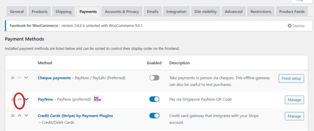
During checkout, you can show multiple ways for the customer to pay, including credit card, PayPal, GrabPay, PayNow etc. Many businesses simply add PayNow to their existing payment list without moving it to the top, effectively hiding it in plain sight.
What This Mistake Looks Like
Your checkout is guilty of this mistake if:
- PayNow is at the bottom of the list: It’s listed after multiple credit card options, PayPal, and several Buy Now, Pay Later (BNPL) services, forcing users to scroll to find it.
- It’s not mobile-friendly: The PayNow button is tiny on a mobile screen, or the layout breaks, making it difficult to tap. In some cases, it’s only offered on the desktop version of the site.
- The labeling is confusing: Instead of using the official name and logo, you’ve labeled it “Bank Transfer” or “Direct Deposit,” which sounds slow and old-fashioned compared to the instant nature of PayNow.
Why It Costs You Money
Poor positioning directly translates to lost sales and higher costs.
- Mobile-first shoppers give up: With mobile commerce accounting for the majority of e-commerce spending in Singapore, any friction on a small screen is magnified. If a user can’t easily see or tap the PayNow option, they are more likely to abandon their cart.
- You pay higher transaction fees: When customers don’t see their preferred local option, they default to using their credit card. This means you pay a higher percentage fee (e.g., 2.5–3.5% for cards), eating directly into your profit margin on every single sale.
- Cart abandonment increases: For many Singaporean shoppers, PayNow is the fastest and most trusted way to pay a local business. When it’s not immediately obvious, it creates a moment of hesitation and doubt, causing some customers to drop off.
- You lose a marketing opportunity: You can’t effectively run PayNow-only promotions (like free shipping or a small discount) if the option itself is buried at the bottom of the checkout page.
How to Fix It Quickly
Fortunately, this is one of the easiest mistakes to correct.
- Move PayNow higher in the payment list: For customers in Singapore, PayNow should be one of the top two options, if not the default. It’s the local standard, so treat it like one.
- Use clear naming and visuals: Always use the official PayNow logo alongside a clear, descriptive label like “PayNow (Instant Bank Transfer)”. This immediately signals to the customer that the payment is fast and secure.
- Ensure it works flawlessly on mobile: Test the entire checkout process on both iOS (Safari) and Android (Chrome) devices. Make sure the logos, buttons, and instructions are all legible and easy to interact with on a small screen.
Mistake #3 – Confusing or Incomplete PayNow Instructions for Buyers
Even if you position the PayNow option perfectly, the sale isn’t complete. The final step at the actual payment process is where many customers get stuck. Simply displaying a QR code and assuming everyone knows what to do is a recipe for last-minute cart abandonment. Clear guidance is not a nice-to-have; it’s a core part of the checkout experience.
What This Mistake Looks Like
You might be making this mistake if your payment page:
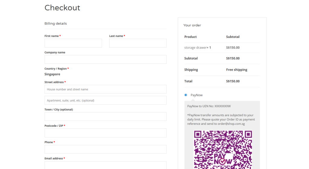
- Is just a QR code: It only shows the scannable image with no supporting text, no step-by-step guide, and no context.
- Lacks backup details: There is no UEN or registered mobile number visible for users who can’t scan the QR (e.g., shopping on their phone) and need to enter the details manually.
- Uses unreadable text: The instructions are written in a tiny font that becomes illegible on a mobile screen, forcing users to pinch and zoom.
- Offers no post-payment confirmation: After the customer pays, they are left on a generic “Thank You” page with no clear message about what happens next, leading to a sense of uncertainty.
Why It Costs You Money
Incomplete instructions create friction and doubt, which directly impact your bottom line.
- Last-step abandonment: Customers who are ready to buy simply give up because they’re unsure of the process. This is the most painful kind of lost sale because they were moments away from converting.
- Alienates certain demographics: Older or less tech-savvy buyers may not be familiar with the nuances of different banking apps. A simple question like “Where do I scan this?” can be enough to make them abandon the purchase.
- Increases support workload: Your inbox or WhatsApp gets flooded with repetitive questions like “What’s your UEN?”, “How do I pay from my bank app?”, or “Is this the correct company name?”. Every one of these messages costs you time.
- Leads to failed payments: Without a clear instruction to verify your registered business name, customers might accidentally send money to the wrong account, leading to frustrated customers and messy refund processes.
How to Fix It Quickly
The fix is to over-communicate. Assume your customer has never used PayNow before and guide them through every step.
- Add clear instructions or a link next to your QR code or PayNow button. Use simple language and icons if possible. For example, your instructions could be:
- Step 1: Open your banking app (e.g., DBS, OCBC, UOB).
- Step 2: Tap the ‘Scan & Pay’ or ‘PayNow’ function.
- Step 3: Scan the QR code on this page
- Step 4: Confirm the amount and reference number, then complete the payment.
Clarity & Trust Enhancers
To create an even smoother experience, you can add a few extra touches.
- Show, don’t just tell: Include a small, generic screenshot of what the confirmation screen in a banking app looks like, highlighting where the payee name and reference fields are.
- Set clear expectations: Add a reassuring message like, “You will receive an order confirmation email within 5 minutes after we verify your payment.”
- Use progressive disclosure: For returning customers, you can have the detailed instructions collapsed by default with a link to “Show Instructions?” This keeps the interface clean for experts while still providing help for novices.
Mistake #4 – Incorrect or Outdated PayNow Details in the Static QR
This is a subtle but dangerous mistake. You’ve provided clear instructions and positioned the PayNow option perfectly, but the QR code itself is a digital landmine. An outdated or incorrect QR code doesn’t just create a broken payment link; it actively breaks customer trust at the most critical moment of the transaction.
What This Mistake Looks Like
This issue often goes unnoticed until a customer complains or a payment goes missing. You might be making this mistake if:
- Your QR is linked to an old account: The static QR code still points to an old personal or business bank account, or an old UEN from before your company restructured.
- The QR file is low-quality: You’ve re-uploaded a blurry, low-resolution, or corrupted QR image during a website update, making it impossible for banking apps to scan.
- There are name discrepancies: The business name displayed in your checkout instructions (e.g., “Awesome Gadgets Store”) is different from the official payee name that appears in the customer’s banking app after scanning (e.g., “John Tan Sole Proprietorship”).
Why It Costs You Money
A faulty QR code is a direct path to lost revenue and operational chaos.
- Customers abandon payment out of fear: When a customer scans a QR and sees an unexpected or mismatched business name, their immediate reaction is to suspect a scam. This creates instant distrust, causing them to abandon their cart. A study by the Baymard Institute found that 19% of online shoppers have abandoned a cart during checkout because they didn’t trust the site with their information.
- Money is sent to a forgotten account: Payments might be successfully sent to an old bank account that you no longer monitor daily. This leads to massive fulfillment delays, angry customers demanding their orders, and a cash flow headache as you try to track down the missing funds.
- It creates refund and correction nightmares: When a payment goes to the wrong account, you have to spend non-billable hours coordinating with the customer, processing a refund, and asking them to pay again.
- It damages your brand reputation: In the worst-case scenario, customers who encounter a mismatched name might report your website as fraudulent, leading to potential issues with payment processors and long-term damage to your brand’s credibility.
How to Fix It Quickly
Treat your PayNow QR code like a critical piece of business infrastructure. It needs to be verified and managed carefully.
- Confirm your current registration: Log in to your business banking portal or call your bank to confirm the exact UEN/mobile number and the official registered payee name linked to your PayNow account. This is your single source of truth.
- Regenerate your official QR: Do not use a third-party QR generator. Download a fresh, high-resolution static QR code directly from your bank or your integrated payment gateway.
- Replace the QR code everywhere: Conduct a full audit and replace the old QR file in every location it’s displayed. This includes:
- Your website checkout page
- Transactional emails and PDF invoices
- WhatsApp and Telegram catalogues or order bots
- Social media profiles (e.g., Instagram Highlights, link-in-bio pages)
- Perform a full end-to-end test: Ask a friend or use a different phone to make a small test payment. Scan the QR on your live site, confirm the payee name matches exactly, and verify that the funds appear in the correct bank account instantly.
Mistake #5 – No Acknowledgement or Confirmation After PayNow
The customer has scanned your (now correct) QR code, checked your business name, and hit ‘Confirm’ in their banking app. The money has left their account. But from their perspective, the transaction isn’t over.
What happens next will determine whether they feel confident and satisfied or anxious and regretful. Failing to acknowledge their payment instantly creates a “payment void”—a period of uncertainty that undermines the entire checkout experience.
What This Mistake Looks Like
This mistake turns the instant nature of PayNow into a slow, manual process. Your business might be doing this if:
- You show a generic success page: After payment, the customer is redirected to a page that simply says, “Thank you for your order. We’ll contact you shortly.” This message provides no confirmation that their payment, specifically, was successful.
- There are no notifications: The customer’s phone remains silent. No automated email or SMS arrives in their inbox to confirm that their order is now “Pending verification” or “Processing.”
- Confirmation is tied to manual checks: You or your staff only check the business bank account a few times a day. An order paid for at 9 AM might only be officially confirmed after lunch, leaving the customer in limbo for hours.
Why It Costs You Money
This post-payment silence is a major source of friction and cost.
- It creates customer anxiety and support tickets: The number one question anxious customers ask is, “Did you receive my money?” Every minute you spend answering these messages is a minute you’re not spending on fulfillment or marketing. This erodes customer confidence and increases your operational overhead.
- It lowers the repeat purchase rate: A smooth, reassuring checkout experience builds trust and encourages loyalty. When a customer feels anxious after their first purchase, they are less likely to return. The instant gratification of a quick confirmation is a key part of the modern e-commerce experience.
- It leads to higher cancellations on big-ticket items: For larger purchases, buyer’s remorse can set in quickly. If a customer doesn’t get an immediate confirmation, that small window of doubt can be enough for them to change their mind and request a cancellation.
- It creates an extra manual workload: Constantly having to refresh your bank statement, match transactions, and then manually send out confirmation emails is inefficient and doesn’t scale. It’s a reactive process that creates bottlenecks as your order volume grows.
How to Fix It Quickly
You need to close the communication gap immediately after the customer pays, even if you can’t fully automate verification yet.
If you don’t have system integration:
- Immediately show a specific on-page message: Change your generic “Thank you” page to something that manages expectations. For example: “Payment sent! We are now verifying your PayNow transfer. You will receive an official order confirmation email within the next 15 minutes.”
- Auto-send an “Order Pending” email: Use your e-commerce platform’s built-in tools to immediately trigger an email that confirms their order has been received and is now awaiting payment verification. This reassures the customer that your system is working.
If you can integrate:
- Use a payment gateway with real-time updates: Choose a payment provider (like HitPay, Stripe, or others in Singapore) that can detect incoming PayNow transfers in real-time and send an automated signal (a webhook) back to your e-commerce store.
- Trigger automatic “Order Confirmed” notifications: Configure your store so that when it receives this signal, it automatically updates the order status to “Paid” and sends the official “Your Order is Confirmed!” email or SMS. This is the gold standard and requires zero manual work.
Mistake #6 – Poor Reconciliation and Record-Keeping for PayNow Payments

Once you’ve nailed the customer-facing confirmation, the next challenge is what happens behind the scenes. Getting the money is only half the battle; knowing which payment belongs to which order is where profit is protected. Poor reconciliation is the silent killer of operational efficiency, turning your simple PayNow process into a complex and costly puzzle.
What This Mistake Looks Like
This is the mess that builds up after the sale. Your back-end processes might be a problem if:
- You’re running on spreadsheets and chat logs: Your entire financial record for PayNow sales is a combination of a messy Excel file, your bank transaction list, and endless scrolling through WhatsApp and Instagram DMs to find payment screenshots.
- Payment references are a free-for-all: You have no control over what customers enter in the reference field. Some type their name, some use the order number, some describe the product they bought, and many leave it completely blank.
- There’s no daily reconciliation process: You only check payments against orders “when you have time,” leading to a backlog of unmatched transactions. An issue from Monday might not be discovered until Friday, by which time the customer is already angry.
- You rely entirely on screenshots: You treat customer-sent screenshots as the ultimate source of truth, without cross-referencing them with your actual bank statement. This is not only inefficient but also insecure.
Why It Costs You Money
This internal chaos quickly translates into real financial losses.
- Missed or double-shipped orders: This is the most direct cost. When you can’t confidently match a payment to an order, you either fail to ship a paid order (creating an angry customer) or mistakenly ship an order twice (losing inventory and paying for extra shipping).
- Costly refund mistakes: When a customer requests a refund, you need a clear audit trail. Without it, you risk refunding the wrong amount, refunding a customer who never actually paid, or being unable to prove a refund was processed during a dispute.
- It’s a massive time sink: Manually matching inconsistent references and chasing down screenshots can take hours each week. This is time that you or your staff could be spending on marketing, customer service, or product development—activities that actually grow the business.
- You can’t analyze performance: If your PayNow data is a mess, you have no way of knowing your true conversion rate, which marketing channels are driving the most PayNow sales, or your average order value for PayNow customers. This makes it impossible to make data-driven decisions to optimize your sales funnel.
How to Fix It Quickly
You can bring order to this chaos by implementing a few strict operational rules.
- Standardize the required reference format: This is non-negotiable. Your checkout process must clearly display a unique, pre-generated Order ID and instruct the customer in bold letters: “In your banking app’s reference field, you MUST enter this exact code: SG12345”.
- Reserve optional fields for notes: Instruct customers that the primary reference field is only for the Order ID. If they need to add a note, they can use the secondary “comments” field in their banking app.
- Implement a daily reconciliation routine: Make this a non-skippable part of your daily closing process.
- Step 1: Export the day’s transaction report from your business bank account.
- Step 2: Open your e-commerce platform’s order list for the same day.
- Step 3: Match the reference number from each PayNow transaction to an Order ID. Mark matched orders as “Paid.”
- Step 4: Immediately investigate any unmatched payments or amounts. The sooner you catch an error, the easier it is to fix.
Mistake #7 – Ignoring Mobile UX and Testing Across Banks & Devices
You’ve set up your QR code, written clear instructions, and streamlined your reconciliation process. But there’s a final hurdle: the device your customer is actually using. Designing your PayNow workflow on a large desktop monitor and assuming it will work perfectly on a 6-inch mobile screen is a costly mistake. In a mobile-first market like Singapore, a poor mobile experience isn’t just an annoyance—it’s a direct barrier to conversion.
What This Mistake Looks Like
This mistake manifests as a series of small but frustrating obstacles for the mobile user:
- An unusable static QR: The QR code is so small that a user trying to pay on their phone can’t scan it with a different device, or it’s displayed on the very screen they need to use for their banking app, creating a catch-22.
- Unresponsive instructions: The carefully written step-by-step guide becomes a jumbled wall of text on a narrow screen, with important details or buttons cut off from view.
- A broken app-switching flow: The checkout process breaks when the user switches from their mobile browser to their banking app and back again. They return to find their cart empty, their session expired, or the page stuck in a loading loop.
- A one-bank-fits-all assumption: The instructions are written based on how one specific banking app (e.g., DBS PayLah!) works, which may have slightly different labels or steps compared to OCBC Digital or UOB TMRW, causing confusion for a large portion of users.
Why It Costs You Money
Ignoring the mobile user experience is one of the fastest ways to lose sales in Singapore.
- Most of your customers are on mobile: Any friction is amplified when it affects the majority of your audience. Mobile commerce makes up 66 percent of the Singaporean e-commerce market, meaning two out of every three potential customers will experience these issues.
- Technical issues cause broken flows: Different mobile devices and browsers (Safari on iOS, Chrome on Android) can handle QR codes, links, and page redirects in slightly different ways. Without testing, you won’t know that your payment flow is broken for 20% of your users.
- Bank-specific differences create confusion: Small variations in UI between banking apps can make generic instructions feel wrong, eroding a customer’s confidence at the final step. If they can’t find the exact button you described, they may assume the process is faulty.
- It leads to silent drop-offs: Customers who encounter these issues rarely contact support to complain. They simply give up and close the tab. You lose the sale without ever knowing why.
How to Fix It Quickly
Proactive and comprehensive testing is the only way to solve this. Treat your mobile checkout as the primary checkout experience.
- Test the full payment process end-to-end on:
- Devices: At least one iOS (iPhone) and one Android (e.g., Samsung) device.
- Browsers: Safari, Chrome, and Samsung Internet.
- Banks: The apps for at least the three major local banks—DBS, OCBC, and UOB.
- Make your static QR mobile-friendly:
- Add a “Tap to copy UEN” button directly below the QR code. This is a critical backup for users shopping on their phone.
- For desktop users, consider adding a feature to “Send payment details to my phone” via SMS or WhatsApp, so they can easily complete the payment on their preferred device.
- Ensure your checkout page is technically sound:
- It must load fast on 4G/5G networks, not just on Wi-Fi.
- It must keep the cart state so that when a user switches to their bank app and returns, their order is still there.
Turn PayNow Into a Conversion Booster
PayNow isn’t just another payment method; it’s the default choice for a huge segment of Singaporean shoppers. Optimizing it is one of the highest-leverage activities you can undertake to reduce checkout friction, cut operational costs, and build the kind of trust that turns one-time buyers into loyal customers.
By avoiding these common pitfalls, you can transform PayNow from a source of operational headaches into a powerful conversion booster.